
Back
Enggal Group Indonesia
How I designed a website for a multi-brand group without compromising the visibility and discoverability of each individual brand.
Duration
2 Weeks
Role
Web Designer
Enggal Group is a culinary group with 10+ brands and 30 outlets across Indonesia. They wanted to build a website where people could easily get to know the group and explore all the brands under it.
The main challenge was the large number of brands, which could easily split users' attention. This made it harder for each brand and even the group itself to stand out clearly.
This project aimed to create a clear and balanced experience that helps users explore each brand more deeply while still understanding Enggal Group as a whole.
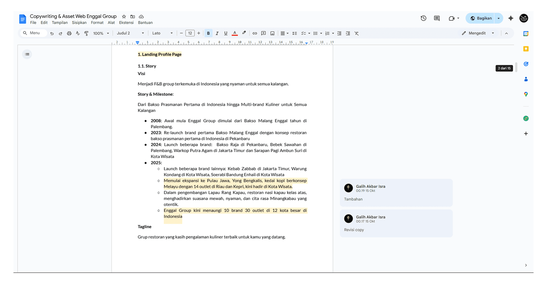
The Enggal team provided initial references, feature lists, and a structural outline for the website. I began by studying the brief and researching similar websites to enrich the visual direction and design approach.
My first step was building the information architecture to make sure the structure matched the client’s goals. I shared it with the PM and client for feedback and approval.
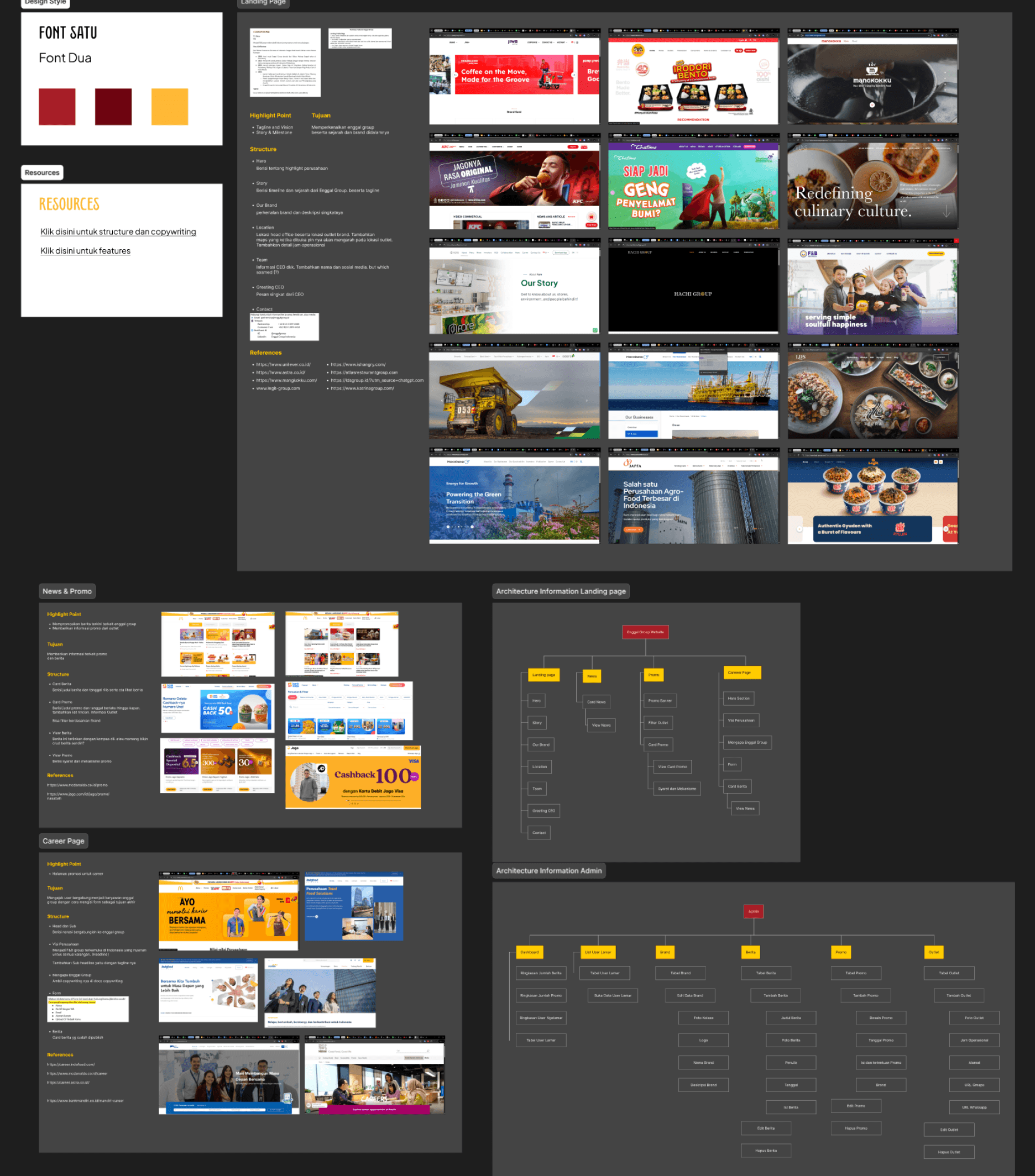
Once approved, I started by exploring the hero section as the visual foundation of the website. I created several design options for the Enggal team to choose from. The selected option became the basis for styling other pages, which helped streamline the design process and maintain visual consistency across the site.
To improve brand visibility, I added micro interactions in the brand showcase section.
These small animations helped make the experience more engaging and encouraged users to explore each brand more deeply.
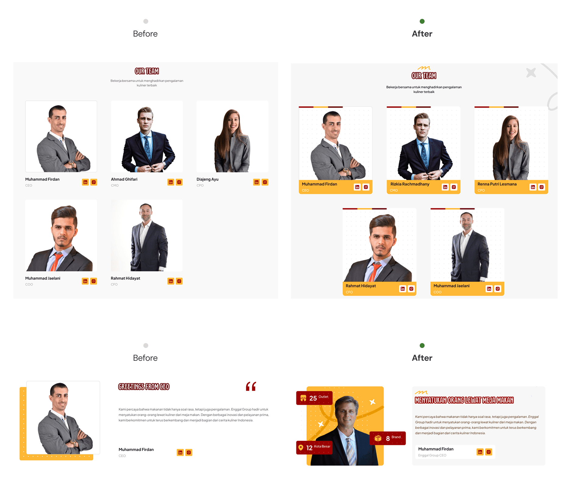
During the iteration phase, the PM and I identified a few sections such as the team and CEO greeting that initially felt too plain. I refined these areas to make them more visually appealing and to better convey the personal side of the brand.
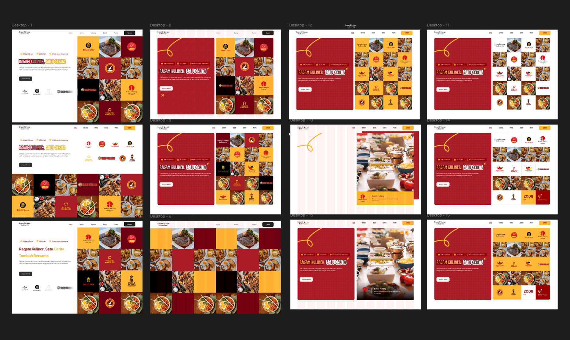
The client also raised a question about how the design would accommodate future brand additions. To address this, I proposed multiple layout solutions and explained the pros and cons of each:
Additional grid layout: Maintains equal visibility among brands, but limits the number of brands that can be shown at once.
Individual card layout: Accommodates more brands, but each card only highlights one brand and could lead to uneven visibility.
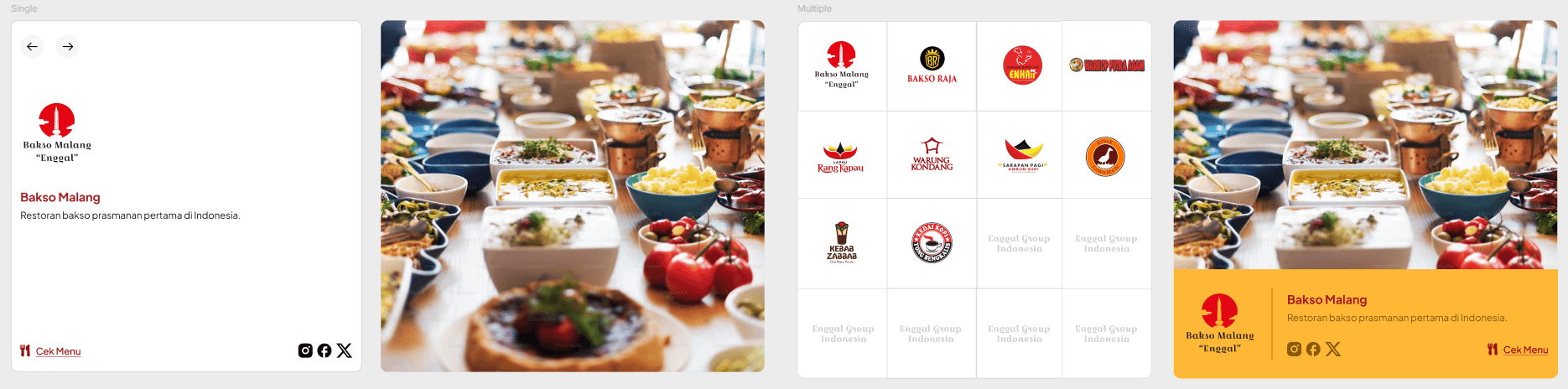
After discussion, the client decided to go with the expanded grid approach, as it offered a more balanced visual hierarchy.
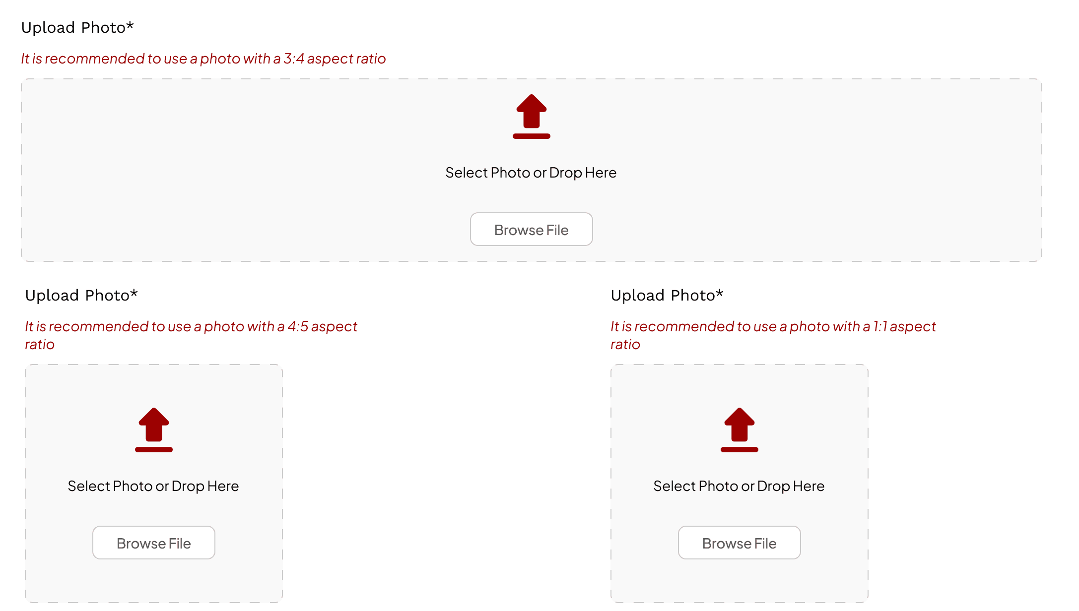
I also designed the admin site to ensure consistency in the visuals used by the client. I provided clear image guidelines, including the best aspect ratios to use, so that every time the admin uploads a photo, it maintains its quality and doesn’t appear distorted or shrunken on the website.
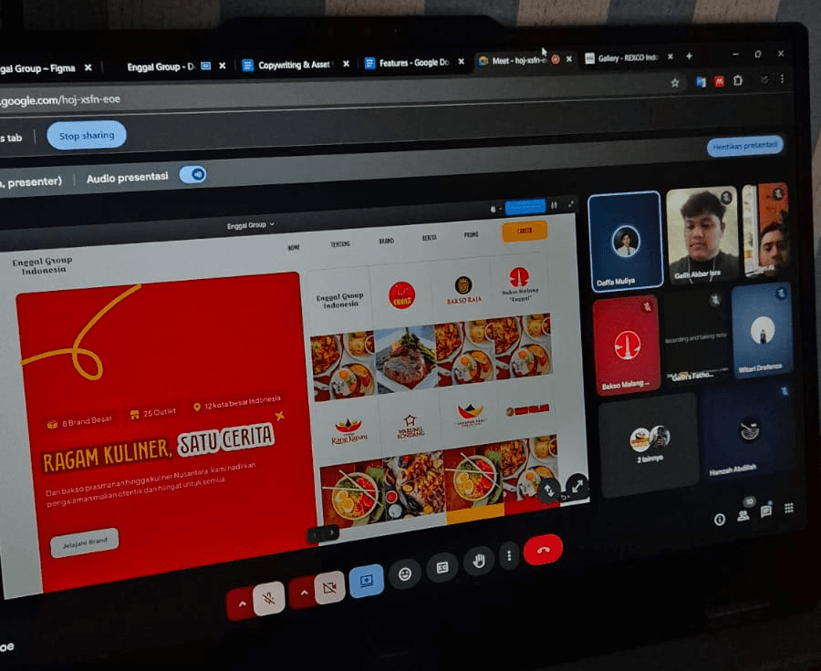
Once all iterations and improvements were complete, I presented the final design to the Enggal team.
The design received positive feedback from the client.
They especially appreciated the micro interactions in the brand showcase, which made the interface feel more alive and encouraged users to engage.
They also suggested improving the outlet map by adding detailed location info for each outlet in different cities. This became a valuable input for the next iteration to enhance the site’s overall content and usefulness.
This project taught me the importance of designing not just for the present, but also for the future growth of a product. With a growing number of brands under Enggal Group, I learned to consider a flexible and scalable structure from layout choices to navigation and responsive components that could easily adapt over time.


See Other Selected Works

