
Paragon - Beauty FMCG Company
Designed a more efficient Proof of Delivery experience for Paragon's internal Transportation Management System, helping streamline delivery validation, reduce cognitive load, and support complex logistics operations across a nationwide distribution network.
Duration
6 Months
Role
UI/UX Designer
Paragon is one of Indonesia's leading FMCG companies, operating a nationwide distribution network that connects distribution centers with offline retail stores across the country.
To support these operations, Paragon developed an internal Delivery Operations System used by field drivers to manage deliveries. One of the most critical workflows is Proof of Delivery (POD), where drivers verify shipment information, confirm delivered items, and provide delivery evidence before completing an order.
"The existing Proof of Delivery experience required drivers to navigate information-heavy screens and complete multiple steps, making delivery validation slower and more difficult especially in outdoor environments."
For better understand these issues, I conducted a heuristic evaluation to uncover usability problems and identify opportunities to simplify the workflow, improve information recognition, and reduce friction throughout the delivery process.
Proof Of Delivert Design - Phase 1
The first phase focused on helping drivers identify and validate delivery information more easily.
Through heuristic evaluation, I found that some screens were text-heavy, making key information harder to scan. Some cards also used similar layouts for different types of information, while important statuses relied mostly on plain text.
To improve this, I explored design alternatives that reduced cognitive effort and improved recognition. I added icons, used contextual colors, and refined the visual hierarchy so drivers could distinguish information faster.
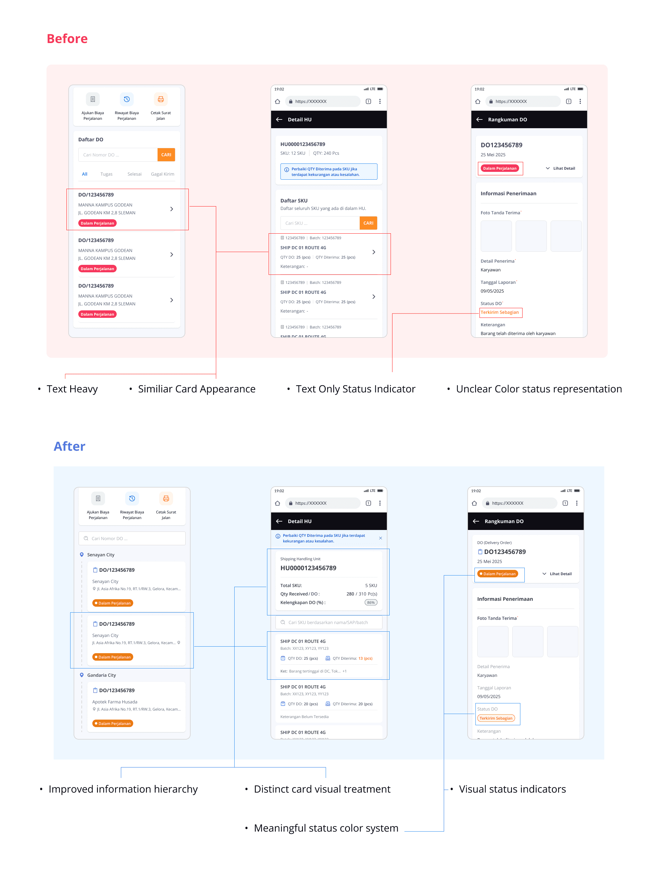
Status labels were also redesigned from plain text into filled badges, making them easier to identify, especially when used outdoors
Impact
Although the redesign was not formally validated through usability testing, the heuristic evaluation helped identify several high-impact usability issues and provided quick wins that improved visibility, information recognition, and overall clarity during delivery activities.
Paragon Transporation Operation Grew
As Paragon's transportation operations grew, the challenge shifted from improving screens to designing a workflow that could scale with the business.
While Phase 1 resolved immediate usability issues, the product itself continued to evolve.
The internal delivery application expanded into a Transportation Management System (TMS) that supports end-to-end transportation workflows across Paragon's nationwide distribution network. This evolution introduced more complex operational scenarios, requiring a fundamental redesign of the Proof of Delivery (POD) experience rather than incremental interface improvements.
Product Color Exploration
As part of the product rebranding or upgrade, I explored a new color system by combining Paragon's brand values, competitor benchmarking, and research on color visibility in outdoor environments. These insights led to a violet-based palette that improved visibility under direct sunlight while establishing a stronger visual identity.
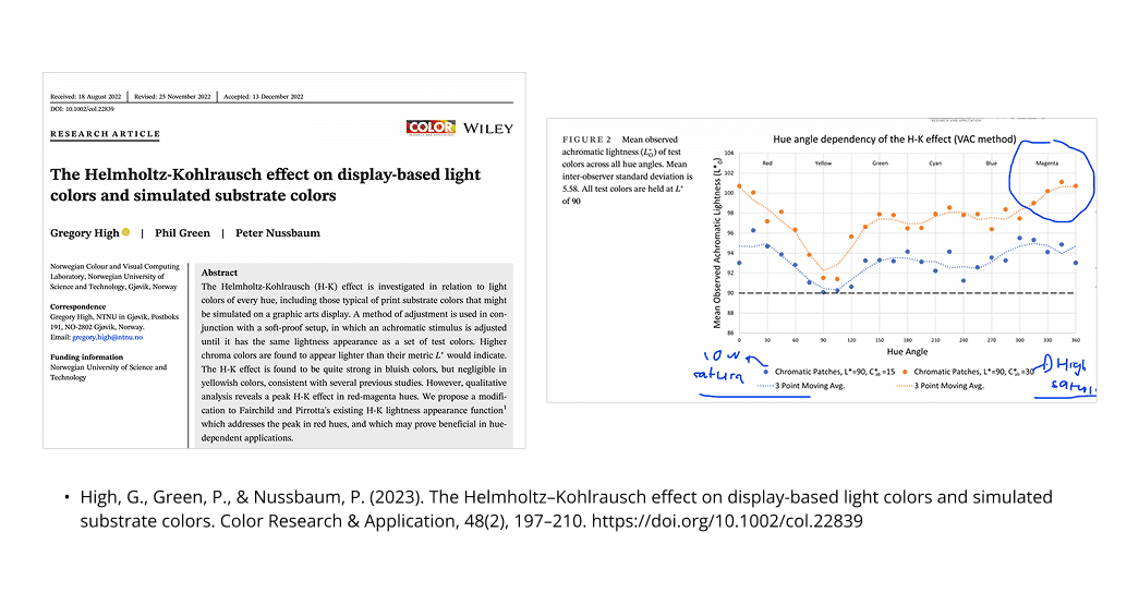
Based on these findings, I proposed a violet and red-violet color palette to improve visibility under direct sunlight while establishing a stronger visual identity for the product.
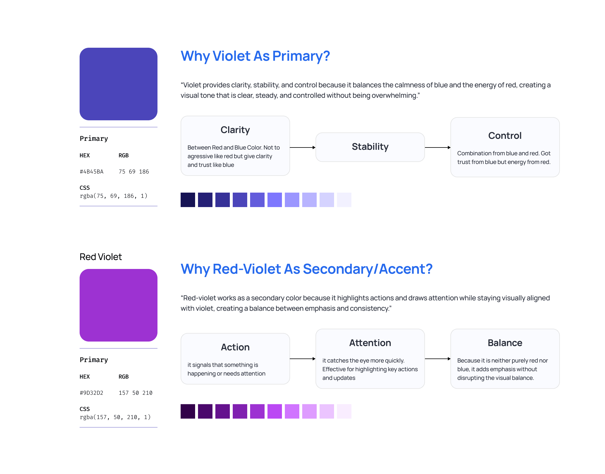
After presenting the exploration, the proposed color system was chosen by the product team and Product Manager as the foundation for the product's visual direction.
Proof of Delivery Redesign Phase 2
The primary focus was simplifying the Proof of Delivery workflow. By redesigning the information architecture, we reduced the process from three steps to two while making critical delivery information easier to access.
"One of the biggest challenges was balancing business requirements with driver efficiency. The business team required all document numbers to remain visible for operational needs, but displaying everything at once created visual clutter that slowed down delivery validation."
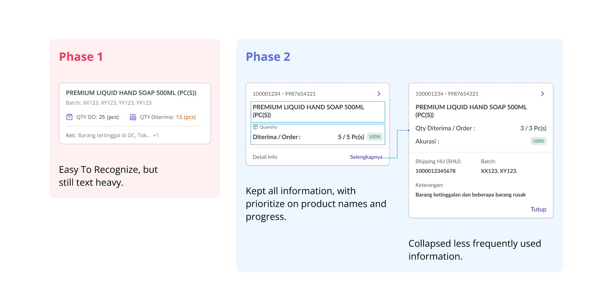
Instead of removing information, we prioritized content based on drivers' validation flow. Product names became the primary focus, while document numbers and supporting details remained available but visually de-emphasized, making delivery cards faster and easier to scan.
Detail Page Improvement
The detail page was redesigned to better support delivery validation activities. Key information such as delivery status was moved to a more prominent position, allowing drivers to immediately understand shipment conditions when opening the page.
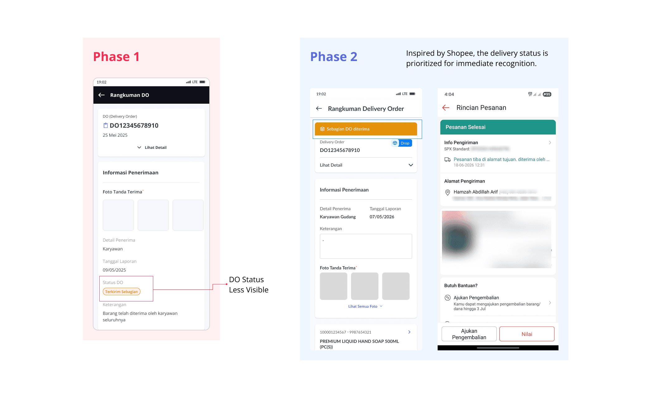
The layout was also reorganized into a two-column structure, reducing unnecessary scrolling and improving space efficiency. This allows users to scan the page more quickly while requiring less scrolling.

Photo Capture Experience
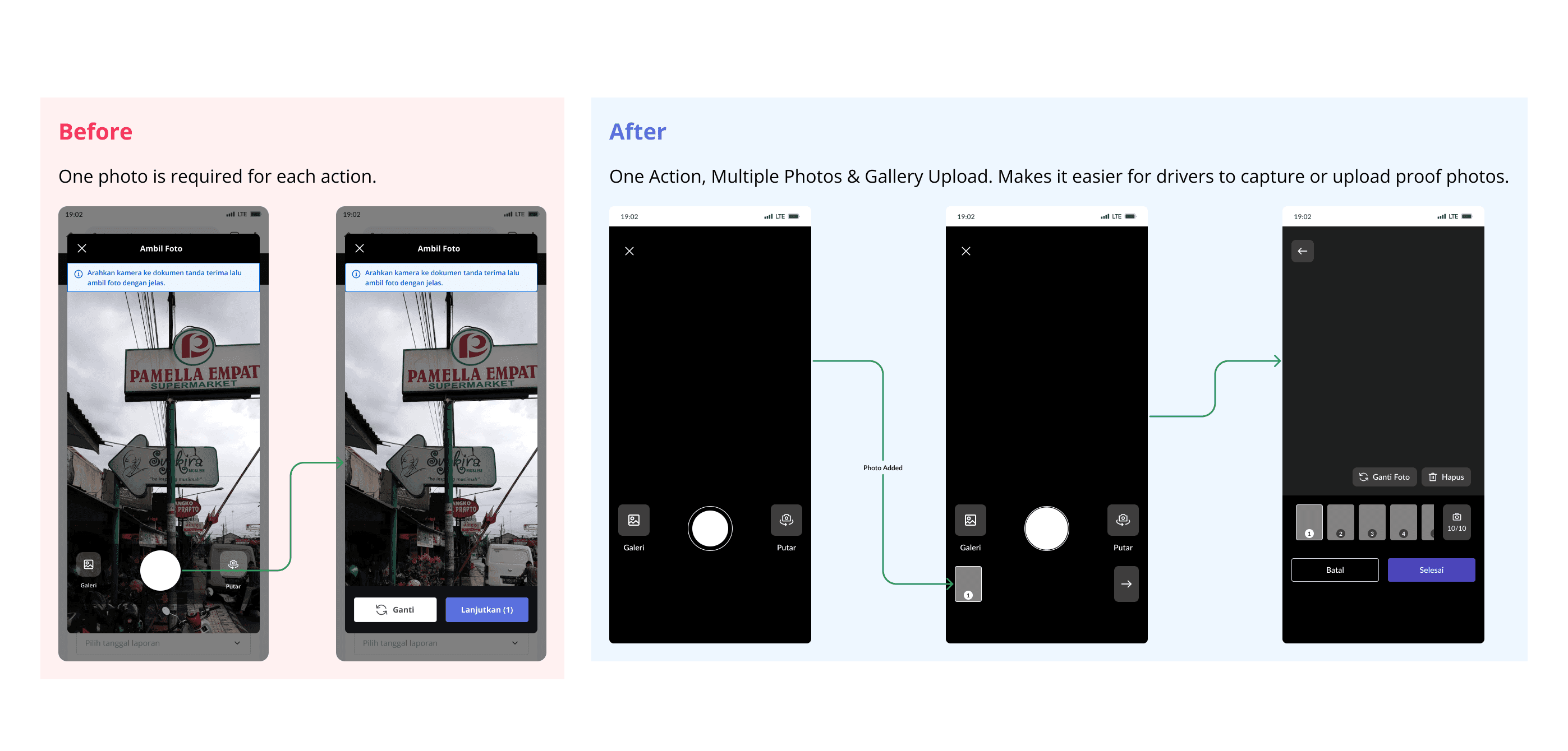
Previously, drivers could only upload photos directly through the camera. The redesigned experience introduced:
Camera capture
Gallery upload support
This provided greater flexibility when completing Proof of Delivery tasks and accommodated different working situations in the field.
The redesign resulted in a cleaner, more scalable delivery experience. By simplifying workflows, improving information hierarchy, and reducing unnecessary interactions, the interface became easier to navigate for drivers operating in fast-paced field environments.
Key improvements included:
Improved information hierarchy and visibility
Reduced visual clutter across delivery screens
Better card differentiation and faster information recognition
Improved space utilization through layout optimization
More flexible photo capture experience
"The biggest lesson wasn't simply simplifying a workflow it was learning how to balance operational complexity, business requirements, and real-world user needs within a single product experience."
One limitation of this project was that I was unable to conduct usability testing and quantitative measurement after implementation, as my contract concluded before the validation phase.
While the redesign was guided by heuristic evaluation findings, stakeholder feedback, and observed workflow challenges, future validation with drivers would help measure the actual impact of the improvements and uncover additional optimization opportunities.
Another important lesson was balancing usability across different environments. Since the application is used both indoors by administrators and outdoors by drivers, design decisions must remain effective under both conditions while maintaining consistency across the overall experience.


See Other Selected Works
See Other Works
2025
Enggal Group Indonesia - Multiculinary Group

